Box Plots, Cumulative Frequency Graphs and Frequency Polygons
Neil Trivedi
Teacher

Contents
Box Plots, Cumulative Frequency Graphs and Frequency Polygons
↓Quartiles and the Interquartile Range
↓Box Plots
↓Comparing Box Plots
↓Cumulative Frequency Graphs
↓Matching Cumulative Frequency Graphs to Box Plots
↓Cumulative Frequency Graphs vs Frequency Polygons
↓Common Errors When Plotting Frequency Polygons
↓Practice Question
↓Box Plots, Cumulative Frequency Graphs and Frequency Polygons
In this note, we look at three ways of illustrating how a set of data is distributed: box plots, cumulative frequency graphs and frequency polygons. The first two are built from the same five key values, so we begin with a quick reminder of quartiles.
Quartiles and the Interquartile Range
When a data set is arranged in order of size, the quartiles are the three values that split it into four equal parts:
The lower quartile of the data lies at or below it.
The median the middle value, with of the data at or below it.
The upper quartile of the data lies at or below it.
The interquartile range IQR: it tells us how close together the middle of the data values are, and it is found by doing
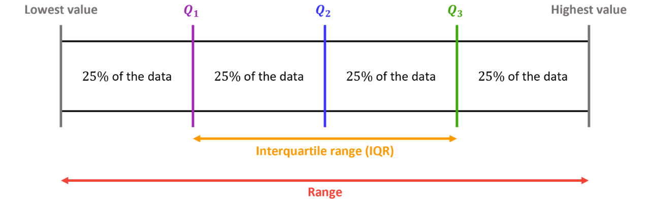
The range (highest value − lowest value) is also a measure of spread, but it depends entirely on the two most extreme values. We usually prefer the IQR because:
it ignores the bottom and top of the data, so it is not distorted by outliers (extreme values);
it describes the spread of the typical, middle half of the data set.
Box Plots
A box plot (sometimes called a box-and-whisker diagram) displays the distribution of a data set against a scale using five values.
The Five Values Needed for a Box Plot
Lowest valueLower quartile Median, Upper quartile Highest value
The box runs from to which means the width of the box is the IQR, and the median is marked by a line inside the box. The whiskers extend from the box out to the lowest and the highest value.
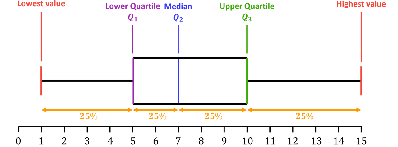
Since the quartiles split the data into four equal parts, each section of a box plot represents of the data. A wider section does not contain more values, only that the same number of values is more spread out.
Example 1:
The table gives a summary of the lengths, in cm, of the fish in a garden centre pond.

a) Draw a box plot for this information.
Single Step: Mark the five values against the scale, draw the box from to with a line at the median, then add the whiskers out to the lowest value and the highest value.

b) Work out how many fish are longer than cm.
Single Step: Identify which quartile cm is, then use the fact that each quartile cuts off of the data.
cm is the lower quartile, so of the fish are longer than cm.

of
So, fish are longer than cm.
c) Decide whether each statement is true or false, giving a reason.
i) “The section to the right of the upper quartile contains more fish than the section to the left of the lower quartile.”
Single Step: Remember that every section of a box plot represents the same proportion of the data.
False as each section of the box plot holds exactly of the data. The right-hand section is wider only because those lengths are more spread out, not because there are more of them.

ii) “The lengths are more spread out above the median than below it.”
Single Step: Compare the distance from the median to each end of the plot.
Below the median: cm Above the median: cm
cm cm, so the statement is true.
iii) “The range of the lengths is cm.”
Single Step: The range uses the highest and lowest values, so check which values give
Range cm IQR cm
False as cm is the interquartile range, not the range. The range is cm.
Comparing Box Plots
Box plots make it easy to compare two data sets drawn on the same scale. In an exam, a comparison is worth marks only when both of these are done in the context of the question.
Comparing Two Box Plots
Compare the medians: which data set has the higher average, and what does that mean in context?
Compare the IQRs (or ranges): which data set is more spread out? A higher IQR means the values are less consistent (as they are more spread out).
Example 2:
The box plots summarise the battery life, in hours, of two brands of wireless headphones.
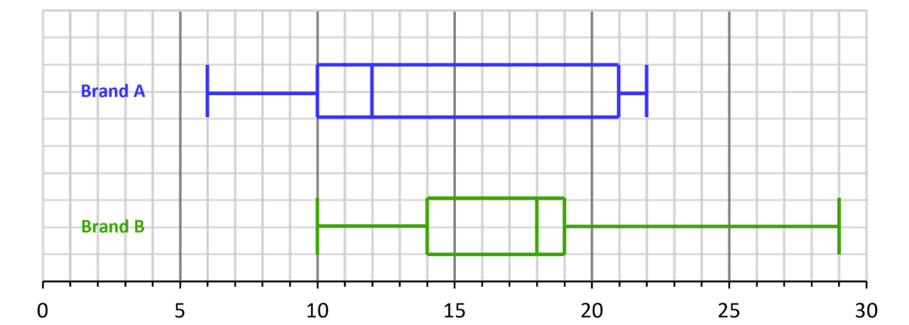
Compare the battery life of the two brands.
Step 1: Compare the medians in context.
Median of Brand A hours Median of Brand B hours
Brand B has the higher median, so Brand B’s headphones last longer on average.
Step 2: Compare the IQRs in context.
IQR of Brand A hours IQR of Brand B hours
Brand A has the higher IQR, so Brand A’s battery life is less consistent (Brand A’s battery life is more varied).
Important note: “Brand B’s median is bigger” on its own would not earn full marks as each comparison must be interpreted in context, e.g. what it means for how long the headphones last.
Cumulative Frequency Graphs
Cumulative frequency is a running total of the frequencies. Plotting it lets us estimate the median and quartiles of grouped data, and answer questions such as “how many values are below ...?”.
Cumulative Frequency Graphs
Drawing: add and complete a cumulative frequency column to the table. This is a running total of the frequencies. When drawing the graph, plot each cumulative frequency against the upper class boundary. Start the graph at the point with coordinates
(lowest boundary, )
and then join the points with a smooth curve or straight lines.
Reading: for data values, read across from the cumulative frequency axis, then down:
read from
lower quartilemedianupper quartile
Because the data is grouped, every value read from the graph is an estimate.
Example 3:
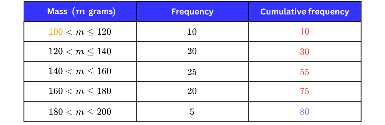
The table shows the masses, in grams, of the apples picked in an orchard.
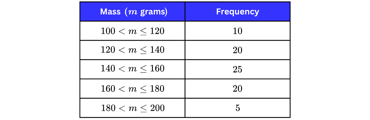
a) Draw a cumulative frequency graph for this information.
Step 1: Add a cumulative frequency column: a running total of the frequencies.
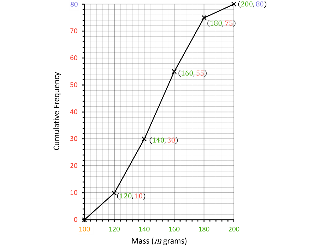
Step 2: Plot each cumulative frequency at its upper class boundary and join the points.
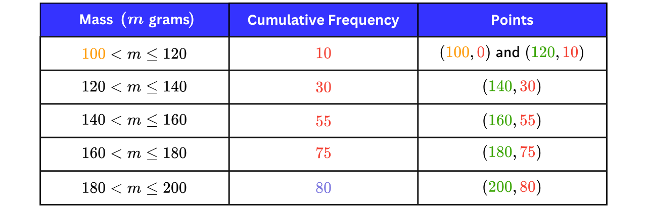
The first point we will plot is as there are no values that have a mass less than g. The lightest apples have a mass between g and g as indicated in the first row of the table.
The table below indicates which coordinates we will be plotting.
b) Use your graph to estimate the median and the interquartile range of the masses.
Step 1: Find the reading positions on the cumulative frequency axis for
Lower quartile at Median at Upper quartile at
Step 2: Read across from each position to the curve, then down to the mass axis.
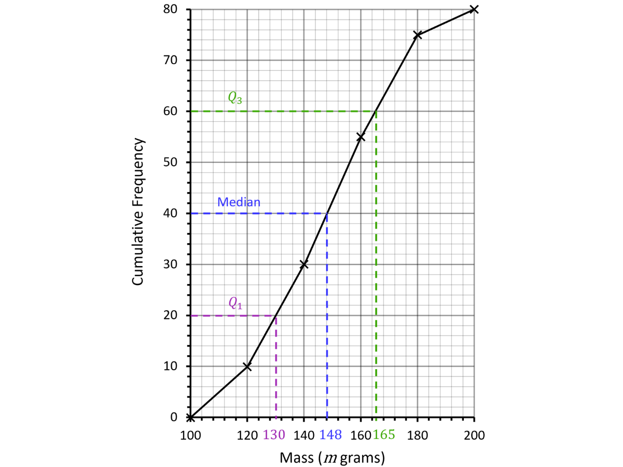
g Median ≈ g g
IQR g
Therefore, the median is g and the interquartile range is g.
Note: since we are estimating from a graph that we have drawn ourselves, there would be a small range of answers that would be accepted, but we should always try to be as accurate as possible.
c) Estimate how many apples have a mass that’s less than g.
Single Step: Draw a line up from g to the curve, then across to the cumulative frequency axis.
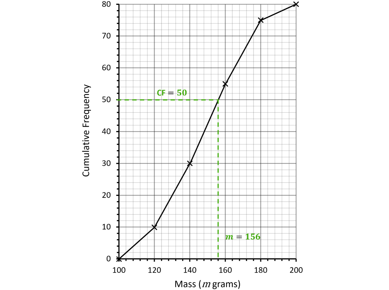
Cumulative frequency at g apples
Note: remember that the cumulative frequency tells us how many apples have a mass up to a certain point. So, apples have a mass up to g.
d) Estimate how many apples have a mass that’s more than g.
Single Step: Read the cumulative frequency at g, then subtract it from the total.
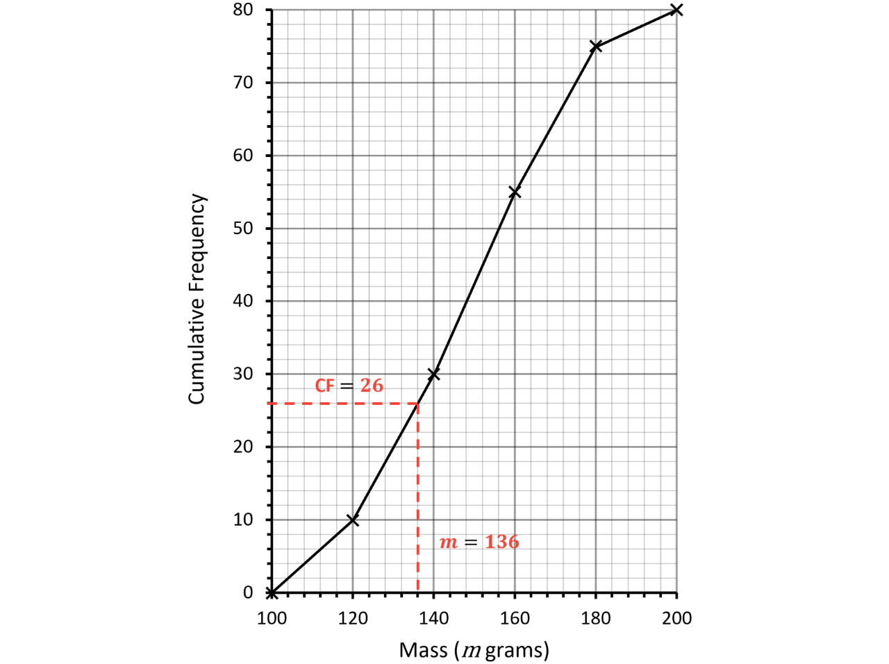
To reiterate, the cumulative frequency tells us how many apples have a mass up to a certain point. So, apples have a mass up to g.
Since the question is asking us for how many apples have a mass above g, we need to subtract from the total number of apples,
Number of apples with a mass above g apples

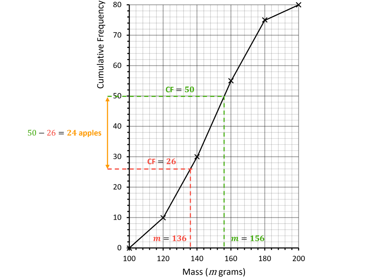
e) Estimate how many apples have a mass between g and g.
Single Step: Subtract the two cumulative frequency readings.
Matching Cumulative Frequency Graphs to Box Plots
A cumulative frequency graph can tell us the same five values required for a box plot, so each CF graph can be matched to the box plot drawn from the same data. The key is the steepness of the curve.
Steepness of a Cumulative Frequency Curve
The steeper the curve, the closer together the data values are in that region.
The box (from to ) sits where the curve rises most steeply; long flat sections match long whiskers, so a few values are spread far apart.
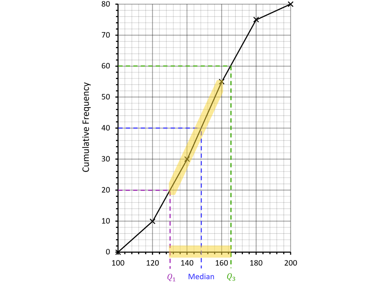
Reading across from and of the total cumulative frequency locates the median and on each graph.
Example 4:
Each of the cumulative frequency graphs, A, B and C, was drawn from one of the box plots, P, Q and R. Match each graph to its box plot, giving a reason for each choice.
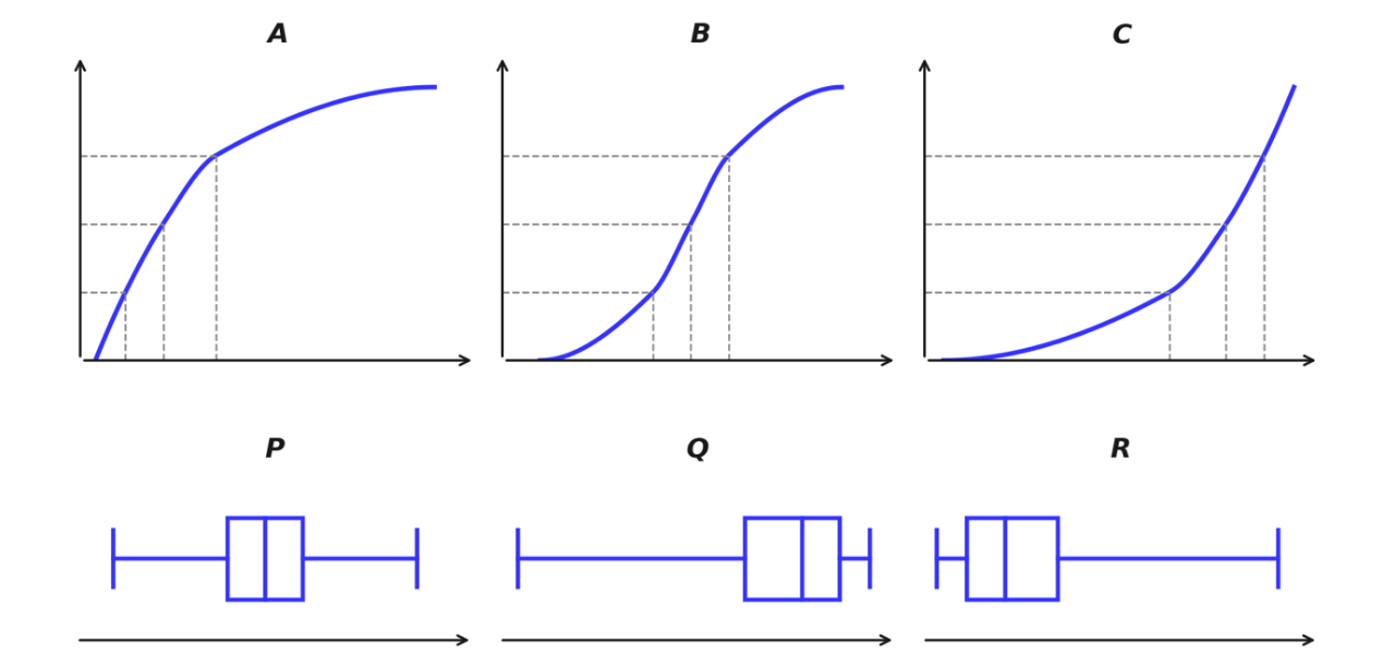
Single Step: Find where each curve rises most steeply; that is where the box must sit.
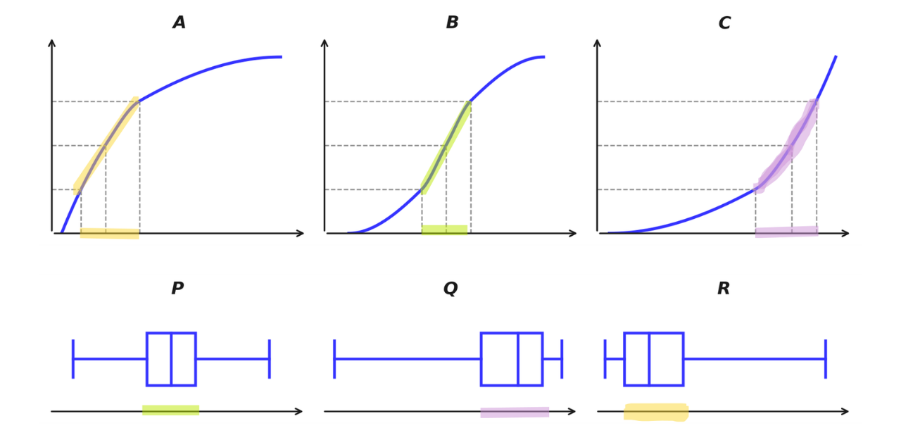
Curve A rises steeply at first, then flattens, which means that most values are small, so the box sits on the left with a long right whisker box plot R.
Curve B is steepest in the middle, which means that the values are bunched around the centre, with similar whiskers box plot P.
Curve C is flat at first, then rises steeply near the end, which means that most values are large, so the box sits on the right with a long left whisker box plot Q.
Cumulative Frequency Graphs vs Frequency Polygons
Both graphs are drawn from a grouped frequency table, but they show different information and are plotted at different positions:
A cumulative frequency graph plots the running total at the upper boundary of each class.
A frequency polygon plots each class frequency at the midpoint of the class.
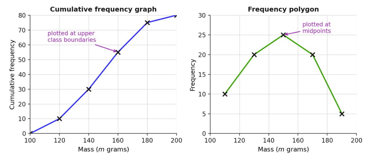
What is a Frequency Polygon Used For?
A frequency polygon shows the shape of a grouped distribution at a glance: where the data is centred, which class is the modal class, and how spread out the values are.
Uses of a Frequency Polygon
Showing the shape of a grouped data set: The peak marks the modal class, and the slopes show how quickly the frequencies fall away on either side.
Comparing two or more data sets on the same axes: Since a polygon is a single line, several can share one grid without hiding each other. This is the most common exam use.
For example, the frequency polygons below compare the masses of the apples picked in two orchards. Both orchards produced apples, so the frequencies can be compared directly.
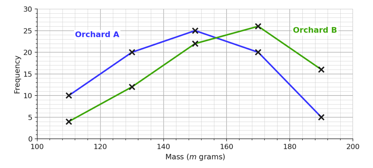
Orchard A’s modal class is but Orchard B’s polygon peaks one class later, at Orchard B’s apples are generally heavier, since its polygon sits further to the right.
Common Errors When Plotting Frequency Polygons
These are the errors examiners see most often. Each one changes the polygon completely, so check for them every time.
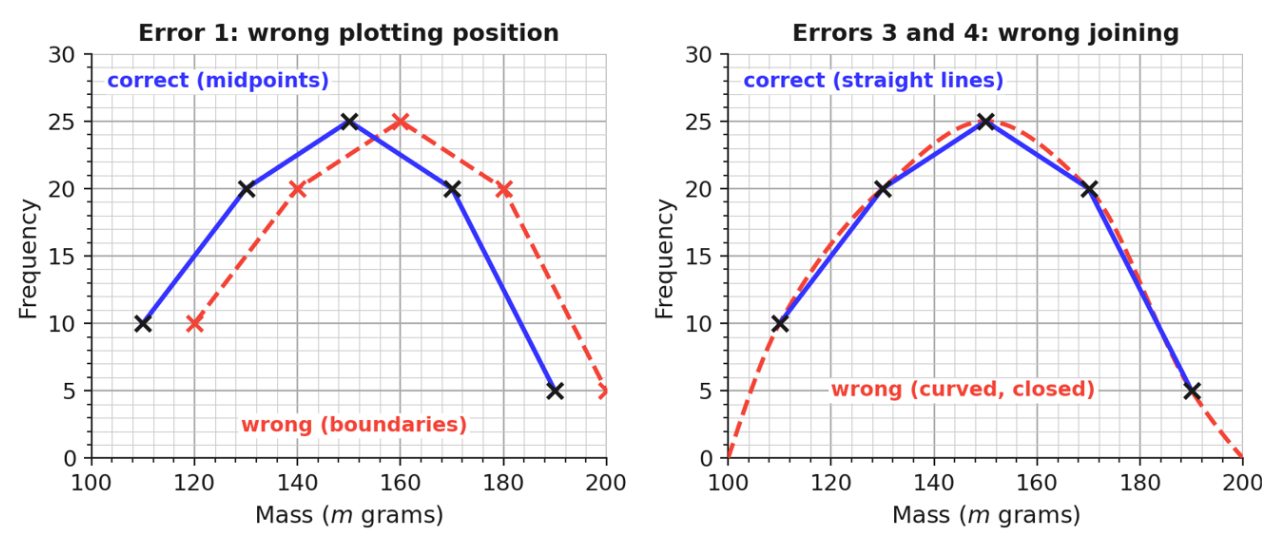
Plotting at class boundaries instead of midpoints: Frequencies belong at the middle of each class, in the same way we use the midpoint when estimating the mean from a grouped frequency table. Plotting at the upper class boundaries shifts the whole polygon to the right; that position belongs to cumulative frequency graphs.
Plotting the cumulative frequency instead of the frequency: A frequency polygon uses the frequency of each class on the vertical axis. If the points climb steadily up to the total, a cumulative frequency graph has been drawn by mistake.
Joining the points with a curve: The points must be joined with straight ruled lines; that is what makes it a polygon (unlike a cumulative frequency graph where a curve may be used).
Closing the polygon down to the horizontal axis: Join consecutive plotted points only. Do not drop the ends to zero, and do not join the last point back to the first.
Practice Question