Histograms
Neil Trivedi
Teacher

Contents
Histograms
A histogram is a way of displaying grouped continuous data, such as heights, masses and times. At first glance, a histogram looks like a bar chart, but the two work differently.
A bar chart uses the height of each bar to show how many values fall in each group. A histogram uses the area of each bar instead, so the height of a histogram bar shows how dense each group is, that is, how tightly packed the data is within that group.
Note: If all the class widths are equal, a histogram will look the same as a bar chart. The difference becomes important when the class widths are unequal.
For instance, consider the table below, which shows the time, hours, that gym members spent exercising one week. The groups have unequal class widths, and each group contains exactly members.
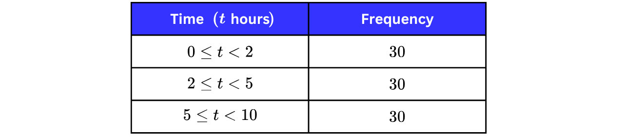
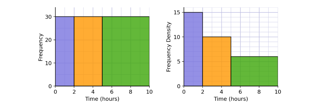
If we drew a chart based on height alone (left chart), the three bars would be equally tall, making the groups look identical. However, they are not: the first group squeezes members into a hour interval, while the last group spreads members across a hour interval, so the first group is far more crowded.
A histogram (right chart) shows this by making the area of each bar equal to the frequency: the bars get shorter as the groups get wider, and the height now tells us how dense each group is.
Key Facts About Histograms
Histograms are used for continuous data, so the bars are drawn on a continuous scale with no gaps between them.
The vertical axis of a histogram shows the frequency density, not the frequency.
The area of each bar of a histogram represents the FREQUENCY of that group.
A histogram therefore tells us three pieces of information: the range that the data covers, the frequency in each group, and how dense each group is.
Histogram Formulae
You may have seen formula triangles used often to help students “remember” the various formulae, but this is not the most efficient way. By knowing one formula, you can easily rearrange it to find the others. That way, you do not fall into the trap of mislabelling your triangle.
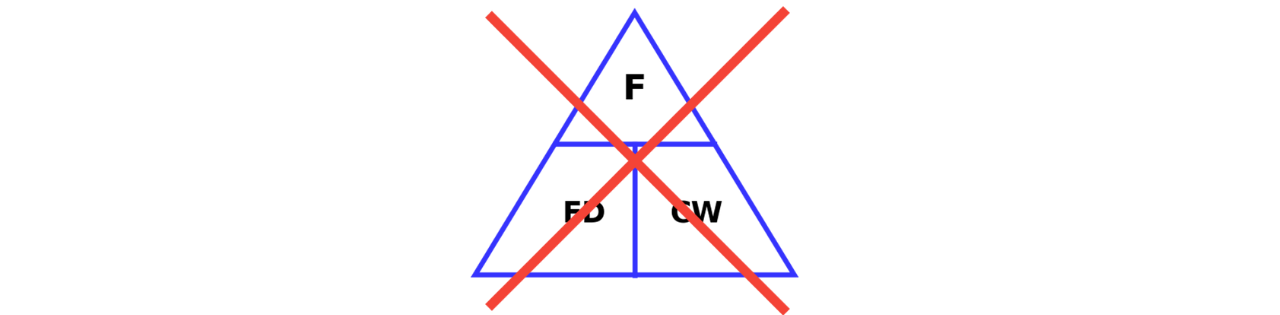
For histograms, it is better to think about the area of each bar rather than using a formula triangle.
So, no formula triangle is needed here. In a histogram, the area of a bar is equal to the frequency, which means the frequency is equal to the frequency density (the height of the bar) multiplied by the class width (the width of the bar), because the area of a rectangle width height.
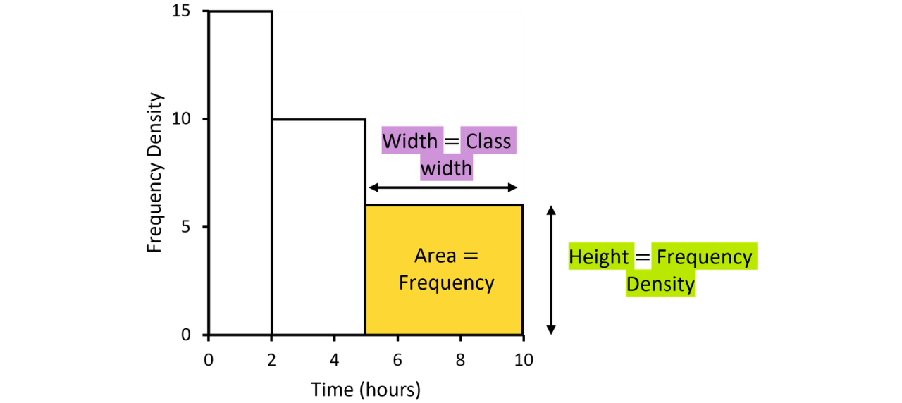
The class width is the difference between the endpoints of a group. For example, in the histogram above, the group has a class width of
The frequency density is the height, which is . So, when we multiply the two values together, we end up with which is the frequency of that group.
The Histogram “Formula”
The area of each bar of a histogram represents the frequency of that group. Each bar is a rectangle, so we use
Area Width Height
where the area is the frequency, the width is the class width, and the height is the frequency density.
We can derive the following result that underlies every histogram question:
Frequency Class Width Frequency Density
Drawing Histograms
Drawing histograms is quite easy, now that we have our “Frequency Class Width Frequency Density” formula.
Example 1:
The table gives some information about the masses, kg, of the parcels handled by a delivery depot one morning.
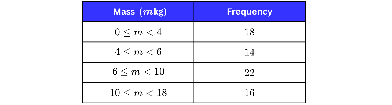
a) Draw a histogram for the information in the table.
Step 1: Work out the class width and frequency density of each group.
The class width is simple; we find the difference between the endpoints of each group. In the first group, that is Let’s fill the table with those values first.
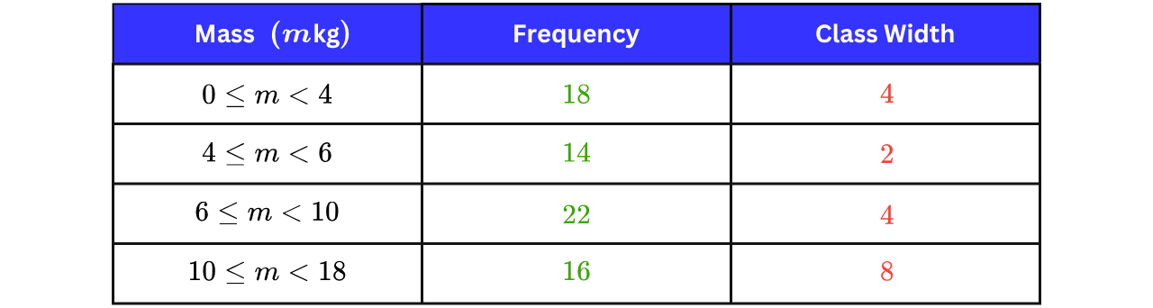
Next, we find the frequency density. To do this, we must rearrange our histogram formula.
Frequency Class Width Frequency Density
To find the frequency density, we divide both sides by the class width.
So, to find the frequency density, we divide the frequency by the class width. Let’s complete our table.
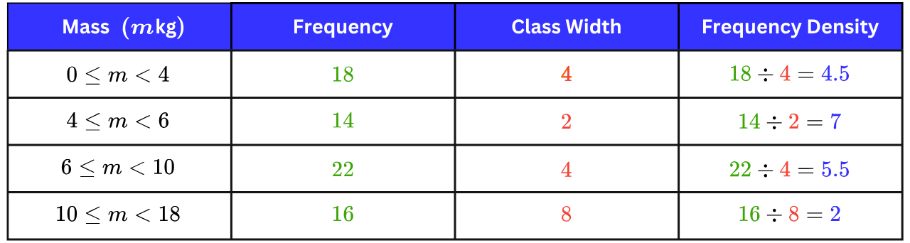
Step 2: Choose a scale for the frequency density axis and draw the bars.
The largest frequency density is so the axis must reach at least We draw each bar across its group with its height equal to its frequency density, making sure there are no gaps between the bars. The exam will provide you with an empty set of axes for you to fill in yourself.
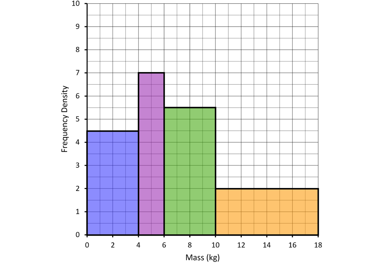
b) Work out an estimate for the number of parcels with a mass greater than kg.
Single Step: Use Frequency Class Width Frequency Density for the part of the bar beyond kg.
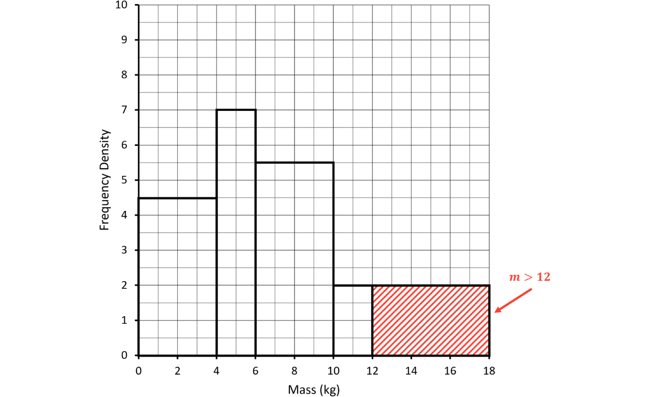
The parcels with a mass greater than kg are represented by the shaded region of the histogram above: the part of the final bar from kg to kg.
This region has a width of and a height of so
Estimated number of parcels
Note: This is an estimate because grouped data does not tell us exactly where each parcel lies within its group, so we assume the parcels are evenly spread across the group from kg to kg.
Completing Tables and Histograms
A very common exam question gives you an incomplete table and an incomplete histogram, where each one contains some of the missing information from the other. The strategy is always the same: any group that appears fully drawn on the histogram has a frequency we can calculate and any group that appears complete in the table has a frequency density we can calculate which lets us draw its bar.
Example 2:
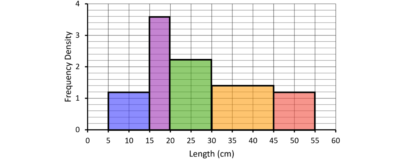
The incomplete table and histogram give some information about the lengths, cm, of the fish caught in a lake one weekend.
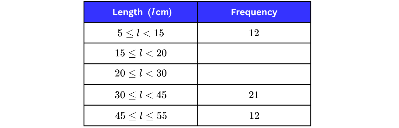
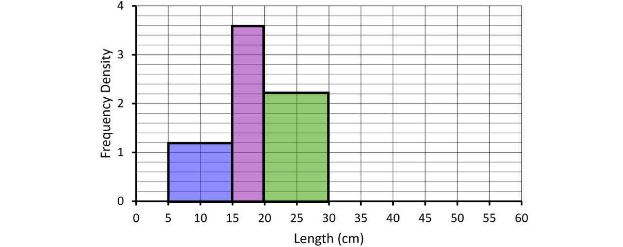
a) Use the histogram to complete the table.
Step 1: Read the frequency density of each fully drawn bar from the histogram.
The bars for (class width ) and (class width ) are already drawn. Reading their heights from the frequency density axis gives and respectively.
Step 2: Multiply each frequency density by its class width to find the missing frequencies.
Frequency
Frequency
The completed table is shown below.
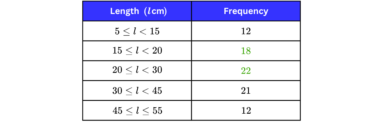
b) Use the table to complete the histogram.
Let’s fill our table with the frequency densities that we already know so far.
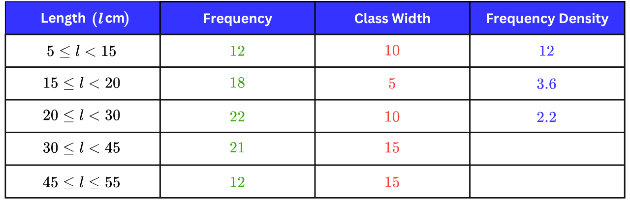
We know already know, from our previous example, that
Step 1: Work out the frequency densities of the last two groups, which are missing from the table.
Frequency density
Frequency density
Our completed table now looks like this:
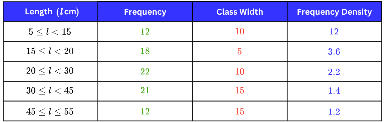
Step 2: Draw the two missing bars at these heights.
Histograms with an Unlabelled Axis
Some questions show a histogram whose frequency density axis has no numbers on it; only the gridlines. On its own, such a histogram only shows the groups in proportion; to recover the actual frequencies, we need one extra piece of information: the frequency of one known group. We use that group to work out what one unit on the axis is worth, and then the whole histogram unlocks.
Finding the Scale of an Unlabelled Axis
Let one unit on the frequency density axis be Write the height of the known group's bar as a number of units, then use Frequency Class Width Frequency Density to form an equation and solve it for
Example 3:
Marceline recorded the time, minutes, that each student in her year group spent doing MyEdSpace homework last week. The histogram shows her results, but the frequency density axis has not been labelled.
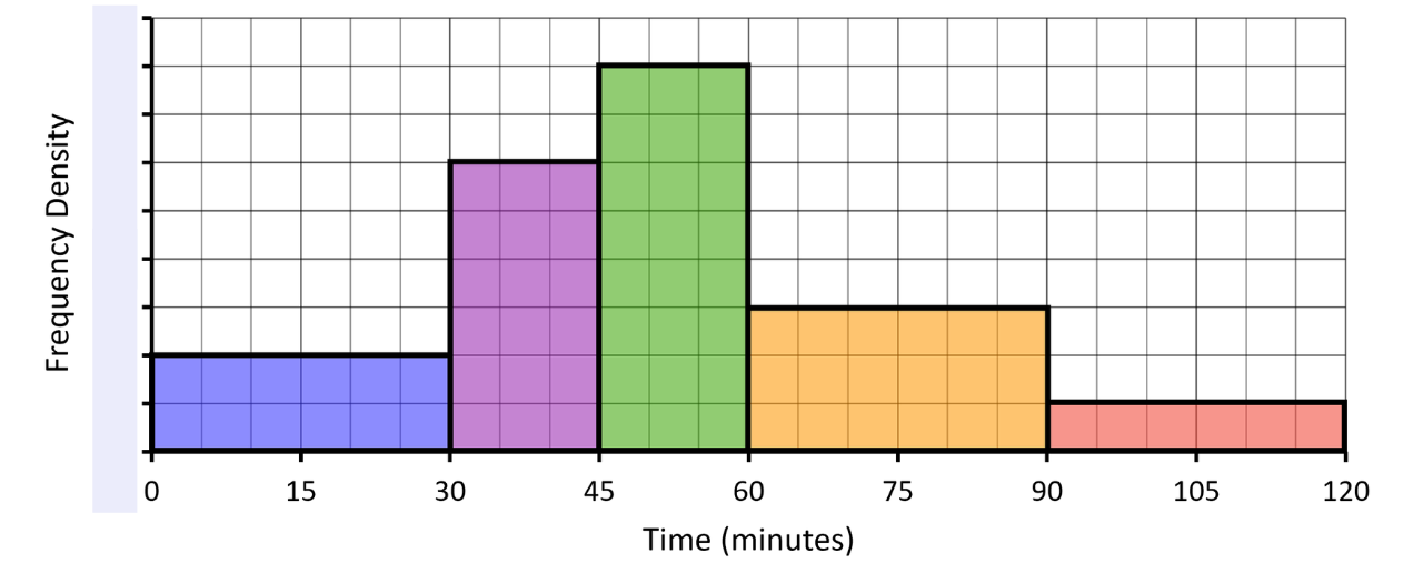
students spent between and minutes on homework.
a) Work out the total number of students in Marceline’s year group.
Step 1: Use the known group to find the scale of the frequency density axis.
Let one unit on the frequency density axis represent Let’s add this scaling to the vertical axis on the histogram.
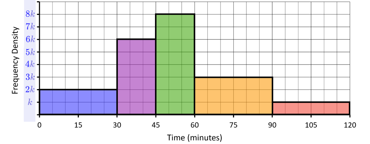
We are given the frequency for the second bar (purple bar that covers data from to minutes). We can find its frequency density by using our formula:
with (the height of the bar), (the frequency given) and (the width of the bar).
Dividing both sides by to find
Therefore, each unit on the vertical axis is worth so the gridlines read going up. The labelled histogram is shown below.
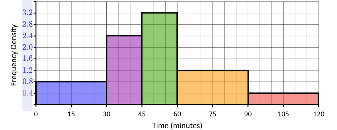
Step 2: Read off each frequency density and multiply by the class width.
Frequency Class Width Frequency Density
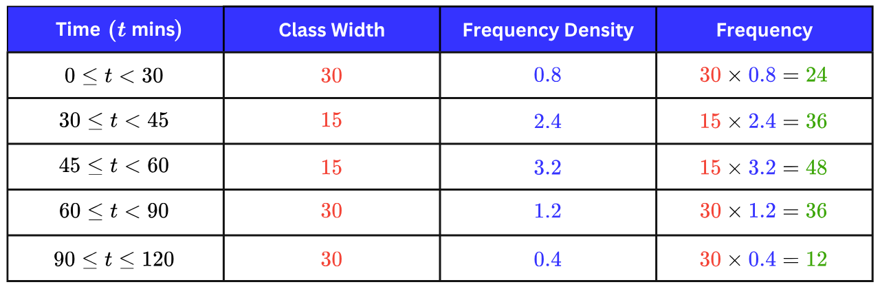
Step 3: Add the frequencies.
Total Frequency students
b) Work out an estimate for the percentage of students who spent between and minutes on their MyEdSpace homework last week.
Step 1: Identify on the histogram the bars, or part of bars, that cover the range between and minutes.
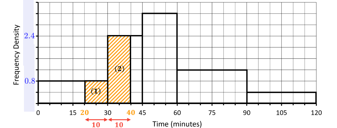
Step 2: Calculate the frequency of each part using Area Width Height.
Frequency
Frequency
Total
Step 3: Calculate what fraction this is out of the total frequency and then convert to a percentage.
Therefore, the percentage of students who spent between and minutes on their MyEdSpace homework last week was approximately to significant figures.
Averages from a Histogram
A histogram shows grouped data, so we never know the exact values inside each group and any average we calculate from it is an estimate.
The easiest way to calculate averages from a histogram is to convert the data in the histogram to a grouped frequency table and then apply the same processes we learned in our Averages for Continuous Data note.
For the median, we need a cumulative frequency column, and for the mean we need the midpoint of each group.
Example 4:
The histogram shows information about the times, minutes, taken by a group of Year students to solve a logic puzzle.
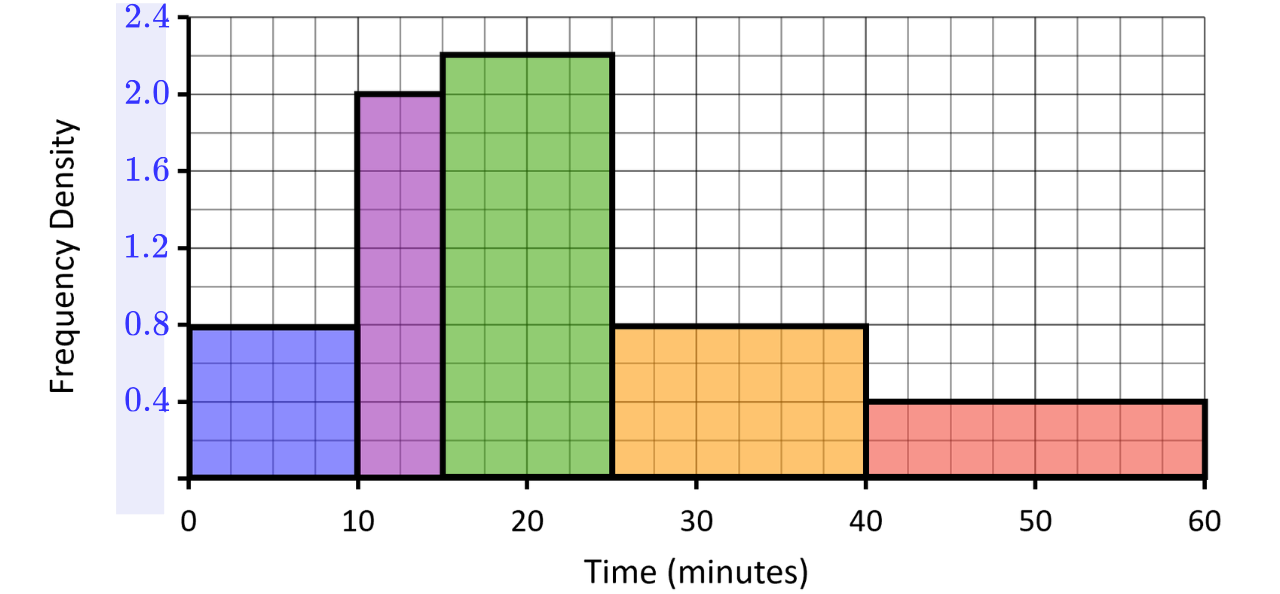
a) Work out an estimate for the mean time.
Step 1: Find the frequency of every group.
Reading each frequency density from the histogram and multiplying by the class width:
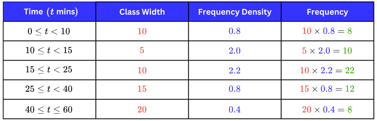
Step 2: Write down the midpoint of each group, then multiply by its corresponding frequency, add, and divide by the total frequency.
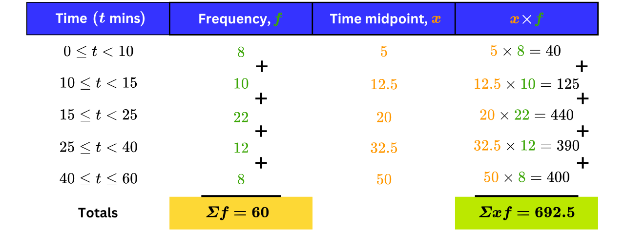
Estimated mean minutes
b) Work out an estimate for the median time.
Step 1: Build a cumulative frequency column in our original grouped frequency table.
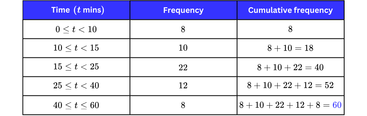
Step 2: Find the position of the median.
For grouped continuous data, with total frequency the median sits at the position in the distribution.
Median position value
Step 3: Find the first class whose cumulative frequency reaches this position.
The cumulative frequency passes during the group (it is at the start of this group and at the end), so the median lies in this group.
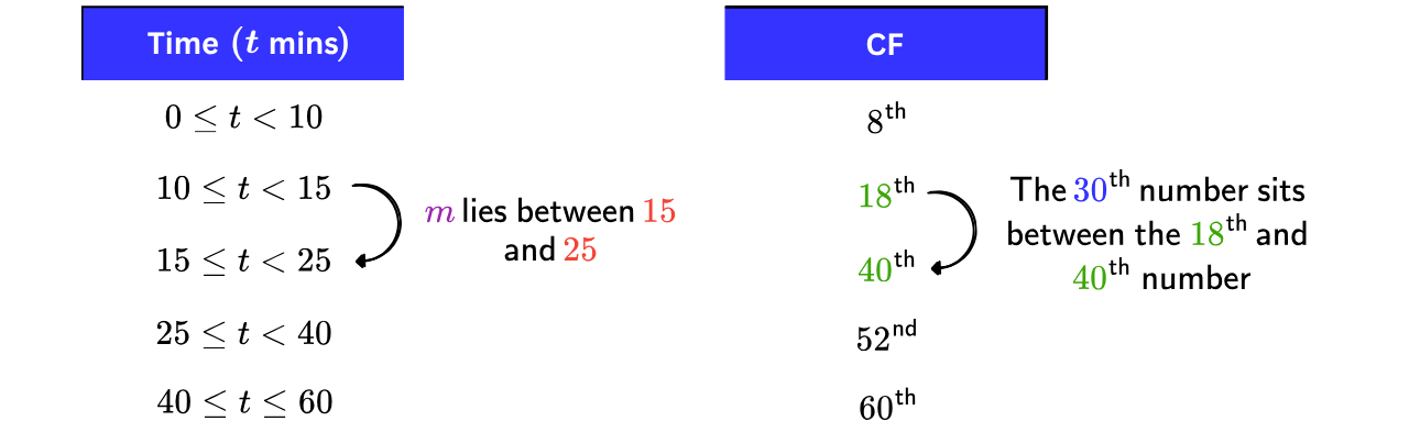
Median class
Step 4: Place the median class on a number line, assuming the values are evenly spread and then interpolate by equating the proportions.
The median is the value. Its class runs from minutes to minutes, and across this class, the cumulative frequency climbs from to :
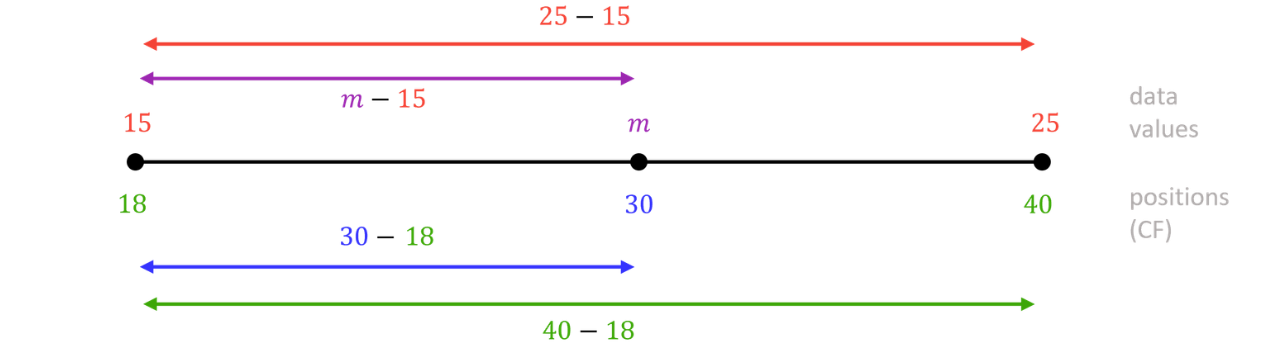
Assuming the times in this class are evenly spread across it, m sits the same fraction of the way along both scales:
Step 5: Multiply the fraction by the class width and add it to the lower end of the class.

Estimated median minutes (sf)
Note: Another common way to estimate the median from a histogram is to work with areas directly. Since area represents frequency, add up the bar areas from the left until you reach then divide the remaining area needed by the height (frequency density) of the bar you land in. This tells you how far into that bar the median sits. You can see neildoesmaths use this method in his third TikTok video below (where he has long hair).
This gives exactly the same answer as the interpolation method, which is used in this note, because both assume that the values are evenly spread within a class. Either method earns full marks in the exam, so use whichever feels more natural.
Practice Question