Drawing tables and plotting graphs
Laura Armstrong & Joe Wolfensohn
Teachers


Topic Explainer Video
Check out this @JoeDoesBiology video that explains drawing tables and plotting graphs, then read the study notes. Once you’ve gone through them, don’t forget to try the practice questions!
Drawing tables and plotting graphs
Your specification says you need to be able to:
Construct and interpret frequency tables, bar charts and histograms.
Use a scatter diagram to identify a correlation between two variables.
How to Construct the Perfect Table
-
Always draw a ruled table with clear headings.
-
The independent variable goes in the first column (left).
-
The dependent variable(s) go in the next columns.
-
Include units in the headings only, not next to each number.
-
Arrange data in ascending order for the independent variable.
Example Table:
|
Concentration of Enzyme (mg/cm³) |
Time Taken for Reaction (s) |
|
0.2 |
50 |
|
0.4 |
37 |
|
0.6 |
25 |
|
0.8 |
16 |
|
1.0 |
9 |
Understanding and Drawing Scientific Graphs
How to Plot a Bar Chart
-
Use a bar chart for categorical data (e.g., blood group, eye colour).
-
Draw equal-width bars, equally spaced.
-
The categories go on the x-axis, frequency / number of / percentage goes on the y-axis.
-
Bars must not touch.
-
You do not need to colour in the bars!
-
Make sure to always label your axes and include any units.
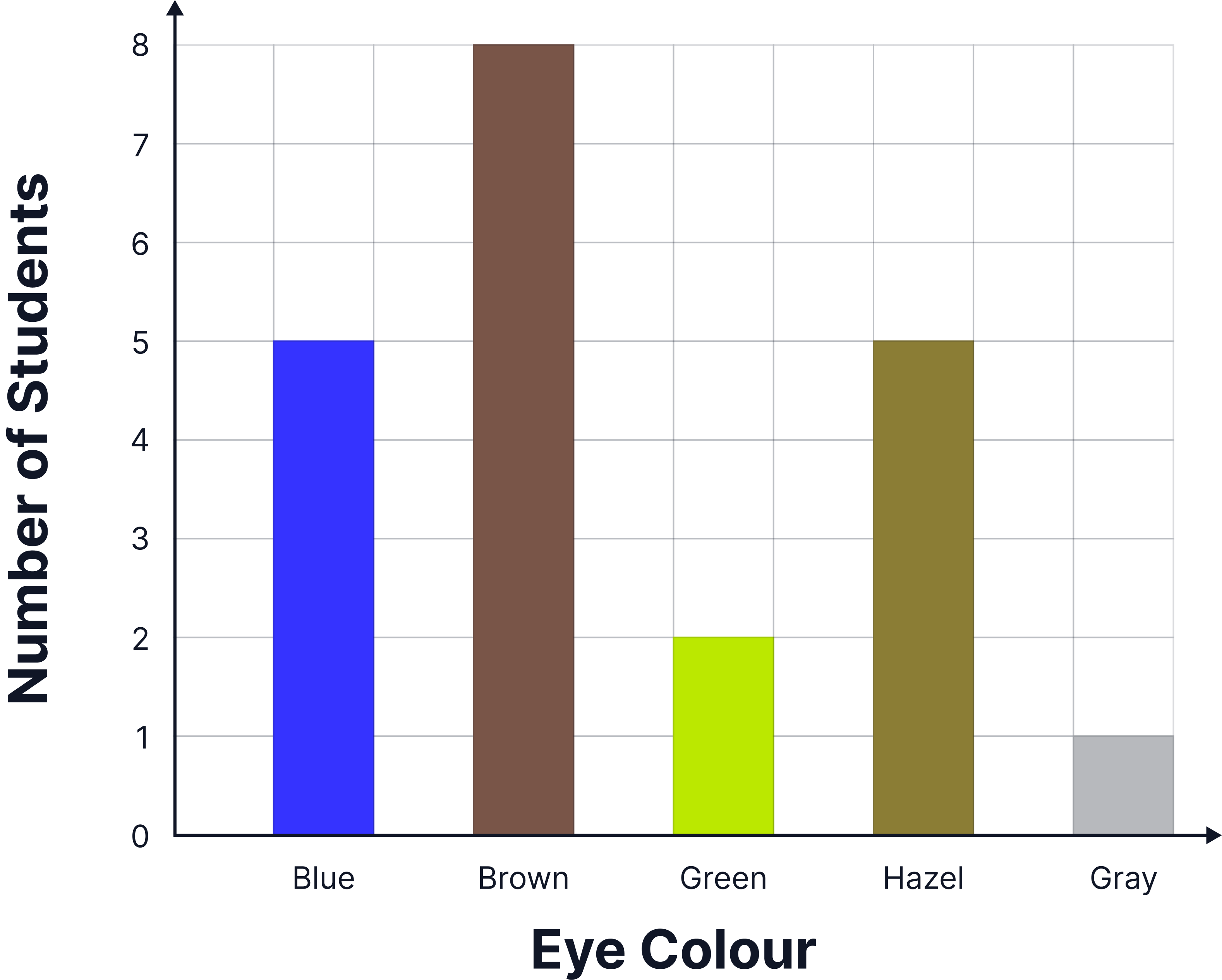
Example:
Plot the number of students with each eye colour.
|
Eye colour |
Number of Students |
|
Blue |
5 |
|
Brown |
8 |
|
Green |
2 |
|
Hazel |
5 |
|
Grey |
1 |
How to Plot a Line Graph
-
Use for continuous data (e.g., temperature vs. rate of reaction) where you have numerical data that can be any value over a range.
-
Use a sensible scale that enables you to plot points accurately.
-
Make sure your plotted points take up over half of the graph paper provided.
-
Label both axes and include the units.
-
The independent variable always goes on the x-axis and the dependent variable always goes on the y-axis.
-
Plot points carefully and double check they are accurate.
-
Draw a line of best fit – a smooth curve or straight line depending on the trend.
-
Do not extend the line beyond the data unless asked.
Example:
IV = Concentration of salt solution
DV = Percentage change in mass
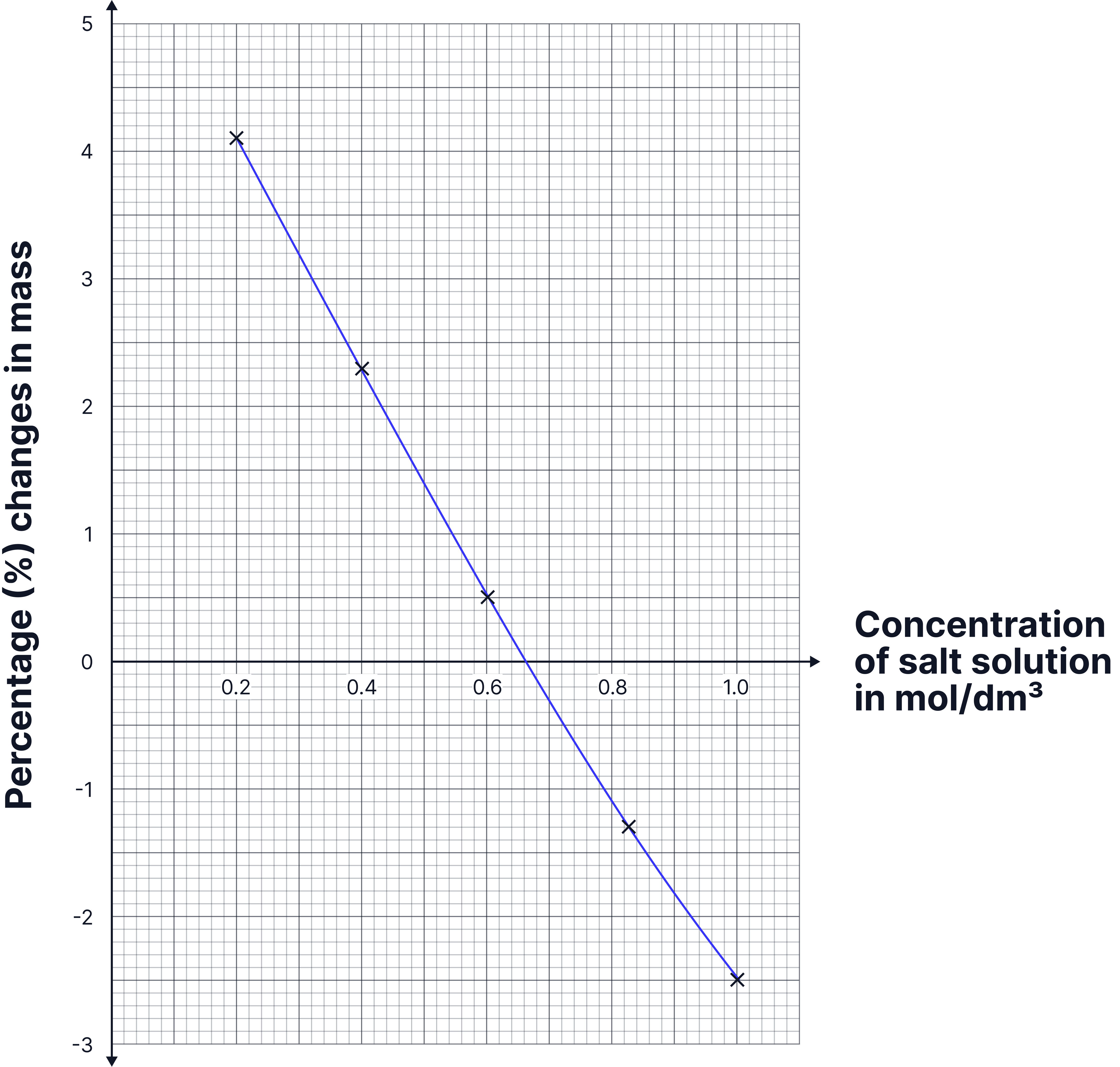
On this graph, the axes are the correct way around and have been labelled fully with units, all points were plotted accurately using small neat crosses.
The line of best fit is a straight line going through the centre of the points.
How to Plot a Scatter Graph
-
Use for two continuous variables to check for a correlation / relationship.
-
Plot each pair of values as a point.
-
Draw a line of best fit through the centre of the points if there’s a clear trend.
How to describe correlations:
-
Positive correlation: as one variable increases, so does the other.
-
Negative correlation: as one variable increases, the other decreases.
-
No correlation: points are scattered with no trend (no line of best fit would be drawn).
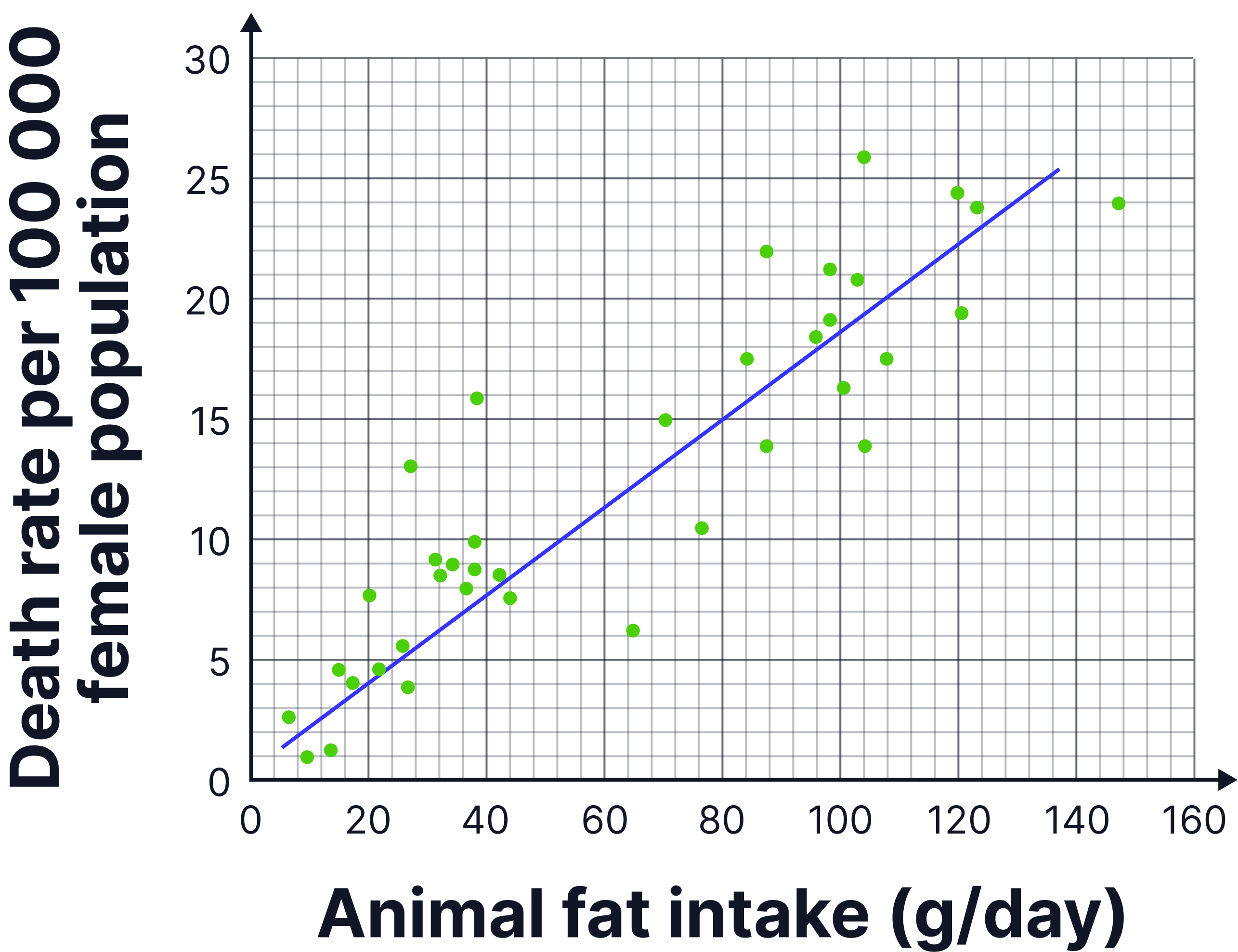
Example:
Animal fat intake vs. death rate per 100,00 females
How to Use a Tally and Plot a Histogram
-
Use a tally table for frequency data (e.g., number of students in height ranges).
-
Height is a continuous variable but students have been grouped into height ranges.
-
For this, we use a histogram where the bars should touch.
-
The x-axis shows the range (class intervals), the y-axis shows frequency.
-
Make sure the class intervals do not overlap. For example, use intervals of 130-134, then 135-149 and 150-154 as seen in the example below.
Example Tally:
|
Height Range (cm) |
Tally |
Frequency |
|
130–134 |
|
3 |
|
135–139 |
|
7 |
|
140–144 |
|
13 |
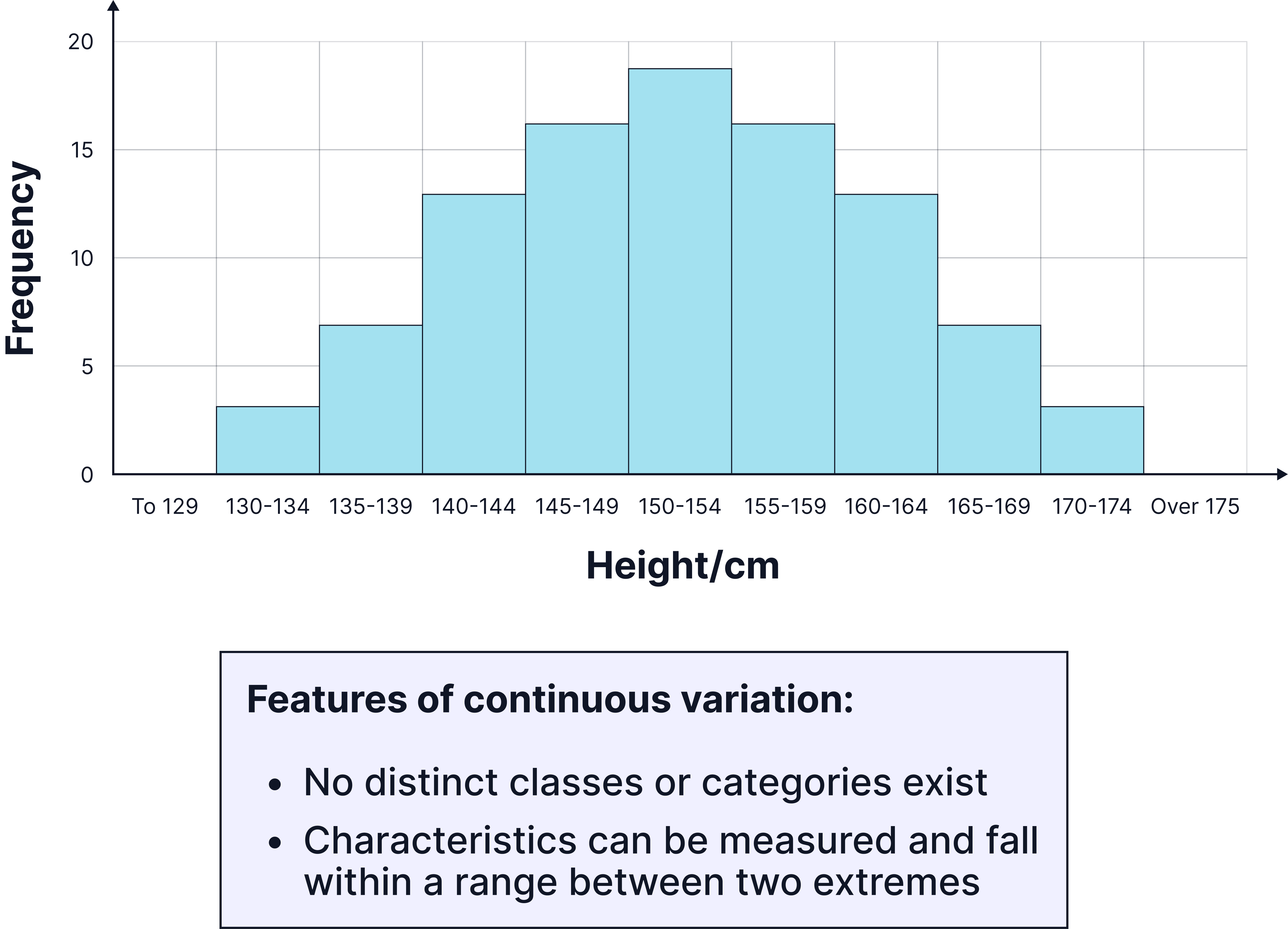
Again, you can see both axes have been labelled, with units where needed.
Bars have been plotted accurately using a ruler.
As height is a continuous variable, the bars on the histogram touch, unlike in bar charts which show discontinuous data.
Practice Question
The table below shows how a blockage in a coronary artery affects blood flow.
|
Percentage (%) of coronary artery that is blocked |
Blood flow in cm3/minute |
|
0 |
100 |
|
10 |
64 |
|
20 |
42 |
|
50 |
8 |
|
80 |
2 |
Complete the graph. (4 marks)
You should:
• use a suitable scale for the y-axis.
• plot the data from the table above.
• draw a line of best fit.
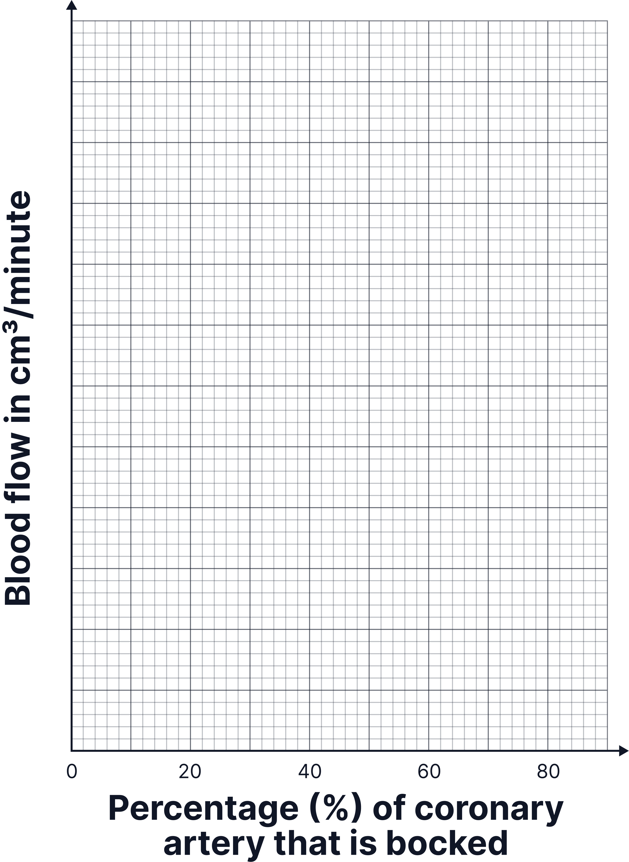
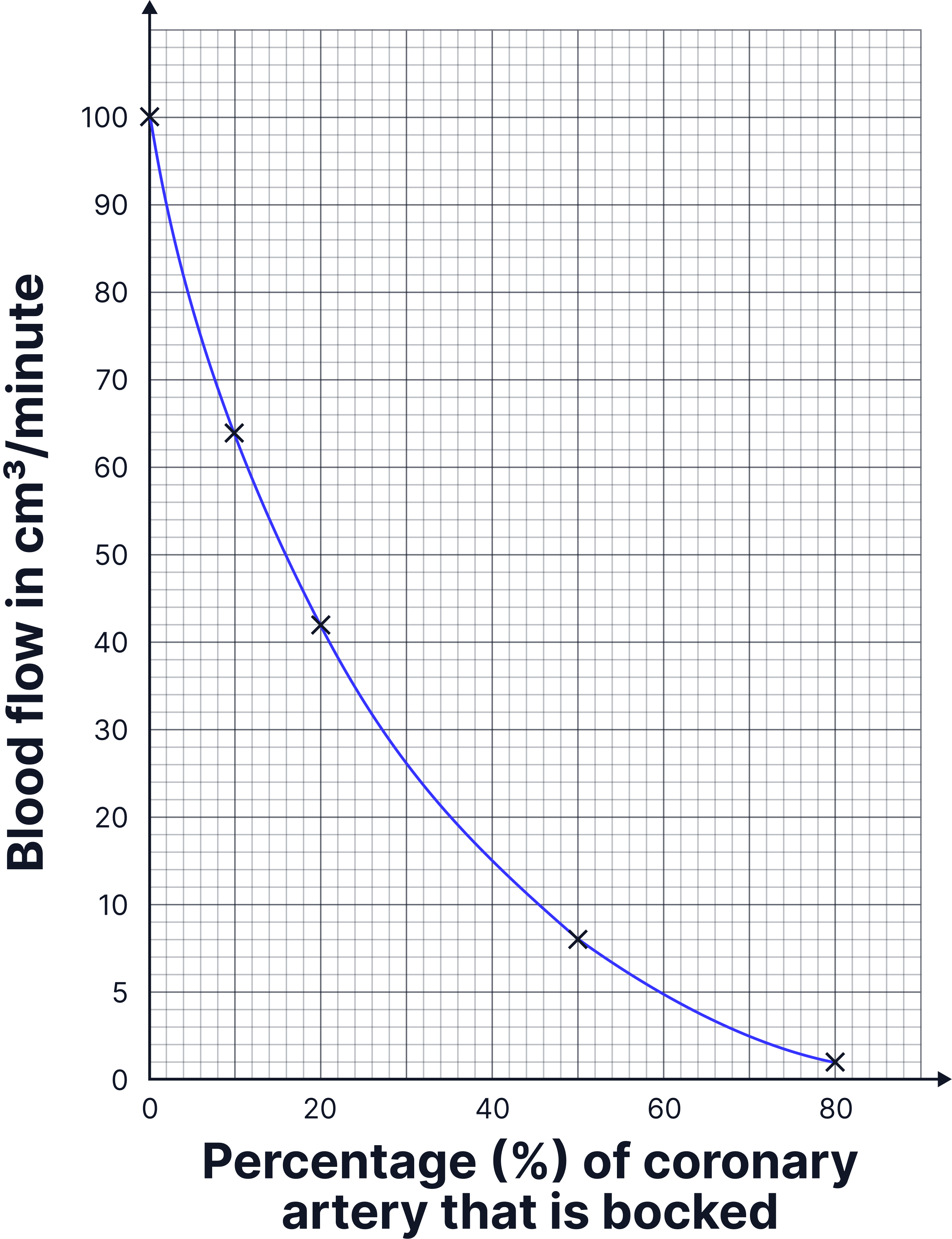
-
scale on y-axis, must take up at least 50% of axis (1 mark)
-
all points plotted accurately (2 marks)
-
correct curved line of best fit (1 mark)
You will not get a mark if you join the lines up dot to dot with a ruler!
More Practice
Try to answer these practice questions from the TikTok videos on your own, then watch the videos to see how well you did!